Visualisierung
Visualisierung Archive
- 1Dec 2025
- 1Jul 2024
- 1Jun 2020
- 1Jan 2013
- 1Apr 2011
- 1Dec 2010
- 1Mar 2010
- 2Sep 2009
- 3May 2009
- 2Mar 2009
- 1Feb 2009
- 1Dec 2008
- 1Nov 2008
- 1May 2008
- 1Apr 2008
- 4Oct 2007
- 5Aug 2007
- 2Jul 2007
- 1Jun 2007
- 2May 2007
- 3Apr 2007
- 2Feb 2007
- 2Jan 2007
- 1Dec 2006
- 1Nov 2006
- 1Oct 2006
- 5Sep 2006
- 5Aug 2006
- 1Jul 2006
- 2Jun 2006
- 2Apr 2006
- 1Aug 2005
- 1Jul 2005
- 1Jul 2004
Visualisierung, Apr 2007
Seit kurzem (?) ist eine erste Version (neudeutsch: Alphaversion ) einer Visualisierungsplattform des Visual Communication Labs von IBM Research online (wo Fernanda Viégas (Biblionetz:p03009) seit neustem arbeitet...) :
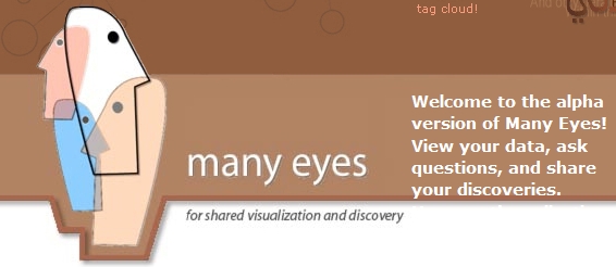
Auf der Website www.many-eyes.com können Visualisierungen von Daten angeschaut werden,
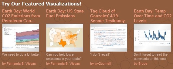
aber auch selbst hergestellt werden:
Absicht ist dabei, die sozialen Effekte von Visualisierungen als Kommunikationsmittel zu erforschen:
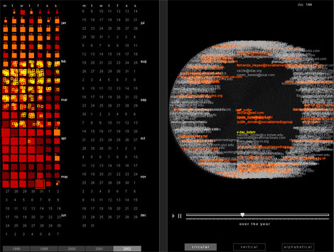
All of us in CUE's Visual Communication Lab are passionate about the potential of data visualization to spark insight. It is that magical moment we live for: an unwieldy, unyielding data set is transformed into an image on the screen, and suddenly the user can perceive an unexpected pattern. As visualization designers we have witnessed and experienced many of those wondrous sparks. But in recent years, we have become acutely aware that the visualizations and the sparks they generate, take on new value in a social setting. Visualization is a catalyst for discussion and collective insight about data.
We all deal with data that we'd like to understand better. It may be as straightforward as a sales spreadsheet or fantasy football stats chart, or as vague as a cluttered email inbox. But a remarkable amount of it has social meaning beyond ourselves. When we share it and discuss it, we understand it in new ways.
(Quelle)
Muss ich noch erwähnen, dass sich dieser Visualisierungsbaukasten wohl in zahlreichen Fächern auf der Sekundarstufe II einsetzen lässt? Diagramm-Kompetenz gehört meiner Meinung nach zur Allgemeinbildung im 21. Jahrhundert...
,
(Quelle)
Und gleich nochmal was zu [[][Visualisierung]]: Wiederum der Schockwellenreiter weist auf einen Artikel im Dr. Web Blog hin, die wiederum auf den Eintrag Infosthetics: the beauty of data visualization von Andrew Vande Moere (Autor des Weblog Infostetics) verweisen.
(Ja, ich habe alle genannten Weblogs abonniert und versuche sie zu lesen, es ist mehr oder weniger eine Frage des Zufalls, wo ich eine Meldung zuerst aus der Informationsflut fische. Das wiederum hat wenig mit Visualisierung, sondern mit Informationsmanagement zu tun).
Screenshot von PostHistory von Fernanda Viégas.
Ahhh, ich möchte die Querverbindungen visualisieren können, die mir heute unterkommen! In einem anderen Browserfenster steht nämlich der Weblog-Eintrag von Michael Feldstein (Weblog e-literate), der auf die Dissertation von Fernanda Viégas unter dem Titel Revealing individual and collective pasts: Visualization of online social archives  (und bald Biblionetz:b03107) hinweist und bei Xing wartet die Anfrage von Andreas Weinberger und Hans Hartmann (vermittelt von Martin Roell), deren Weblog-Einträge ich hier und hier ich bereits vor der Anfrage mit Interesse gelesen habe, aber noch nicht dazu gekommen bin, sie zu verarbeiten...
Ob uns die Information visualization helfen wird, die Informationsflut zu bewältigen, oder ob sie alles nur noch schlimmer macht? Schön sieht's jedenfalls aus.
(und bald Biblionetz:b03107) hinweist und bei Xing wartet die Anfrage von Andreas Weinberger und Hans Hartmann (vermittelt von Martin Roell), deren Weblog-Einträge ich hier und hier ich bereits vor der Anfrage mit Interesse gelesen habe, aber noch nicht dazu gekommen bin, sie zu verarbeiten...
Ob uns die Information visualization helfen wird, die Informationsflut zu bewältigen, oder ob sie alles nur noch schlimmer macht? Schön sieht's jedenfalls aus.
Screenshot von PostHistory von Fernanda Viégas.
(und bald Biblionetz:b03107) hinweist und bei Xing wartet die Anfrage von Andreas Weinberger und Hans Hartmann (vermittelt von Martin Roell), deren Weblog-Einträge ich hier und hier ich bereits vor der Anfrage mit Interesse gelesen habe, aber noch nicht dazu gekommen bin, sie zu verarbeiten...
Ob uns die Information visualization helfen wird, die Informationsflut zu bewältigen, oder ob sie alles nur noch schlimmer macht? Schön sieht's jedenfalls aus.
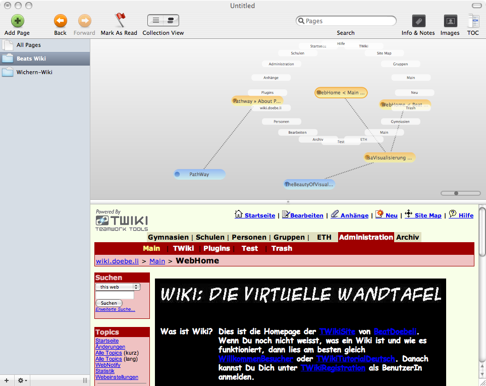
Der Schockwellenreiter weist auf ein Visualisierungstool für Wikis namens Pathway hin:
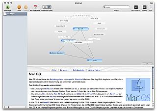
 , obwohl es verlockend aussieht:
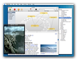
Auf den beiden TWiki-Servern, die ich betreue, habe ich ein Plugin installiert, das dank Touchgraph-Applet, Skript und cronjob-Eintrag aktuelle Visualisierungen der Wikis auf den Servern bietet. Die Usability lässt aber zu wünschen übrig, so dass man nur mit zwei Bildschirmen sinnvoll navigieren kann. Ich vermute, dass ausser mir praktisch niemand weiss, dass dieses Plugin überhaupt installiert ist, obwohl unten auf jeder Seite unten rechts ein Link Graph wartet...
Update: Glücklicherweise habe ich Mac-User unter den Blog-Lesenden und die sind dann gleich noch so nett, Screenshots anzufertigen:
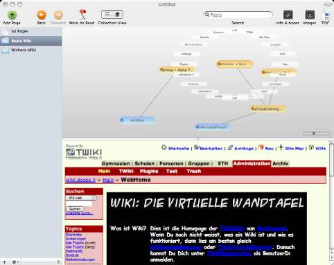
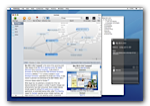
Visualisierung des Beat-Wiki mit Pathway. Das funktioniert sehr schön, danke für den Tipp! TO
,
[The] aim [of Pathway] is to help you discover Wikipedia without having to worry whether youll have enough time to read everything you want, or if youll get lost.
It accomplishes this by presenting you with a graphical network representation of your visited article pages. A node represents an article, a connection between two nodes means, of course, that youve gone from the first article to the second one. You can save the network youve created to disk and recover it.
This way, youre able to keep track of everything: what youve looked at, how you got there and just how it all fits together.
Pathway has a small but useful feature set, is easy to use and tries not to get in the way. Written in Cocoa, it offers the elegance youd expect from a native Mac application.
Hmm, native Mac, somit nichts mit schnell Ausprobieren , obwohl es verlockend aussieht:
Visualisierung des Beat-Wiki mit Pathway. Das funktioniert sehr schön, danke für den Tipp! TO
Kontakt
- Beat Döbeli Honegger
- Plattenstrasse 80
- CH-8032 Zürich
- E-mail: beat@doebe.li
About me
Social Media
This page was cached on 27 May 2026 - 20:57.